Showing posts with label iOS 7. Show all posts

Oct 3, 2013

Schools Complain iOS 7 Upgrade Stripped Filters From Students’ iPads

iOS 7 was supposed to make it easier for schools to manage the iPads that are becoming increasingly common in the classroom. But for some, the latest version of Apple’s mobile operating system is proving to be a bit of a headache.
A number of schools that have upgraded their iPad deployments to iOS 7 say installing the new OS removed the supervision profiles they had installed on the devices. This rendered those iPads unsupervised, depriving administrators of their remote management privileges and eliminating the filtering protections they had established to protect students from inappropriate content they might stumble upon outside school.
iOS7_edu“Apple did not realize that installing iOS 7 would remove our (and thousands of organizations across the country) safety protection measure, which now makes the iPad devices unfiltered when accessing the Internet away from school,” said a memo from the Manitou Springs (Colo.) School District 14 to parents, verified by AllThingsD. “In the short term, the district will be collecting iPad devices at the end of each day until the safety protection measure is reinstalled.”
And Manitou Springs School District 14 is not an isolated case. According to Apple’s support forums and some external IT discussion boards, schools across the United States are grappling with the issue, which is causing a lot of angst and frustration for administrators.
At Manitou, the district ended up collecting hundreds of iPads that had been upgraded to iOS 7, wiping them, and then reinstalling the OS along with the apps and student content originally on the devices. “It’s been a major undertaking,” Superintendent Ed Longfield told AllThingsD.
That’s particularly the case for affected schools with large iPad deployments, some of which have gone so far as to adjust their network settings to block over-the-air iOS 7 updates. “When we first caught wind of the bug, I tweaked our DNS to stop iPads from checking for software updates,” a school administrator who declined to be named told AllThingsD. “That helped us to keep a lot of our iPads running iOS 6.1.3. We plan to maintain those settings until Apple addresses the issue.”
And Apple is working hard to do just that, though it’s not yet clear just when it will have a resolution.
“Some business and education users have reported that their supervised devices have reverted to un-supervised when they upgrade to iOS 7,” Apple spokeswoman Trudy Muller told AllThingsD. “We are aware of this issue and will have a fix this month.”
Courtesy:  AllThingsD

Oct 2, 2013

Apple: iMessage problems to be fixed in upcoming iOS 7 update

A small number of users have been noticing issues with Apple's iMessage service since the iOS 7 update was released last month. In a statement to the Wall Street Journal, the company acknowledged that there was a problem and said that it would be fixed in an upcoming software update.
“We are aware of an issue that affects a fraction of a percent of our iMessage users, and we will have a fix available in an upcoming software update,” Apple said. “In the meantime, we encourage any users having problems to reference our troubleshooting documents or contact AppleCare to help resolve their issue. We apologize for any inconvenience this causes impacted users.”

READ MORE:  Internet Explorer 6 usage drops below 5 percent in September

READ MORE:  Web Marketplace Listia Raises $9 Million

We haven't had any iMessage issues with our own iDevices since updating to iOS 7, but according to several posts on the Apple Support Communities forums (this is one representative thread) affected users are able to receive messages, but unable to send them. Some report that rebooting the device or signing out of and then back into the iMessage service will fix the issue, though that fix is apparently not always successful.
There's some evidence based on server logs that an iOS 7.0.3 update is being tested internally at Apple, and based on this statement, the update may be intended to fix the iMessage issues for the customers who are having problems. If these logs are genuine, this would be the third minor update to the software after iOS 7.0.1, which was released only for the new iPhone 5S and 5C, and iOS 7.0.2, which fixed some high-profile lock screen bugs. We'll keep an eye out for this problem in the release notes for future iOS updates.
Courtesy: arstechnica

Sep 30, 2013

New iOS App Memoir Jogs Your Memory With Old Photos

Call it a first-world problem: The more photos we capture with our fancy smartphones, the more photos we have to sort through.
In the future, we may look back at the many thousands of digital photos we have and think, “When was that trip, again?” or “Where did I enjoy that fantastic meal?” or “How did I manage to take so many photos of pocket lint?”
That’s where Memoir comes in. It’s a free, iOS-only mobile app that launched the same day that iOS 7, Apple’s latest operating system, was released.
Memoir is a photo-storage app that automates an album-like approach to organizing your photos. It pulls photos from your smartphone camera roll and popular social networks.
Then it shows you the most recent ones, as well as photos and social network check-ins from that same day two, three, or five years ago. You can also search for your photos using keywords, such as “July 2011,” “Costa Rica” or a person’s name.
Maybe you’ve heard of TimeHop, the app that shows you what you were sharing on your social networks “a year ago today.” Memoir is like TimeHop for photos.
In addition to jogging your memory, another incentive of the app is that it is completely free, at least for now. There is no cap on the amount of photos you can store in Memoir’s cloud (although, the photos stored are compressed). Many other services will charge you for photo-storage space that exceeds a certain amount.
Memoir1
I’ve been using Memoir for the past five days. It’s nicely designed, and it shows me photos that I’ve completely forgotten about, and reminds me of old friends and adventures, which I really liked.
Sometimes, though, the app feels like it’s not quite ready to deliver on all of its features.
Part of this may be due to the fact that the app has been overwhelmed with new users since launch. Right now, it can take up to a few days for the app to “build your memoir,” or index all of your photos. I first downloaded the app last Saturday, and my Memoir wasn’t ready until Tuesday.
Even then, a couple of the searches I performed — “wedding,” or “Mom” — resulted in search errors, when I know I have plenty of photos stored with those keywords on my social networks.
To start, Memoir pulls photos from your phone’s camera roll and, with your permission and authentication, can also pull from Facebook, Foursquare and Instagram.
Memoir2
There isn’t much manual control offered during this process, so the mobile app pretty much pulls in anything and everything. The company says it’s considering adding more manual control to this, and in the Mac desktop version of the app, users do have control over which sources and folders the app pulls from.
At the top of the mobile app there are five icons — a settings tab, a calendar tab, the main Memoir feed, a notifications bell and a section for logging new memories, or, taking photos and checking in directly from the app.
Once the app has actually made your Memoir, your photos are ready for viewing. They appear in the main Memoir feed, with “Today’s” memories appearing at the top and “Yesterday” below that. Sprinkled throughout the feed are photos from years past.
As I write this, at the top of my Memoir feed is a picture of a coffee cup I took earlier this morning. Below that, it shows me “Memories from 2 years ago today,” with a picture I took of a boat on the South China Sea. If I tap on “See full day” below that, I can see all of my photos and other activity from that day — such as my Foursquare check-in at the Foreign Correspondents’ Club in Hong Kong.
Memoir3
This did jog my memory. One picture actually reminded me that it was a friend’s birthday — who I contacted on the wrong day two years ago due to the time-zone differences — and that I should drop a line to a journalist friend I met while I was traveling two years ago.
It’s one thing to just ingest all of the digital media that’s put in our faces, and it’s another when an app can change behavior or spur action, and for this reason I liked the Memoir feed.
As I mentioned, the search function was okay, but not flawless. When I searched for “Costa Rica,” “Shea” (my niece), and “Christmas,” relevant photos popped up. Other key search terms resulted in search errors.
One small but excellent feature of Memoir is that it recognizes “screen grabs” you’ve taken on your phone, and puts those photos into a separate album in the app.
Memoir4
There are a couple different ways to share photos with friends on Memoir. One of them worked well for me. You can easily select a photo or group of photos and share it with another Memoir user or friend via email. Once a Memoir photo has been exchanged, it will appear in your friend’s Memoir feed, if she has the app. You can also blast the picture out to your social networks. An added bonus: Friends don’t have to have the Memoir app to view the photo.
Memoir also promises that you can smartly share photos with other Memoir users who were at the same event, like a wedding, provided that you were all in the same vicinity. Supposedly, you’ll get an alert that other Memoir users were nearby, and it will ask you if you want to share all photos from that event with one another, even if it’s years later.
This isn’t quite as simple as promised. I tried testing this with my boyfriend, who I asked to download the app. We were both tied to the same Wi-Fi network, checked into the same event location through the Memoir app, and took photos of the same place.
But we were never offered the option to share or copy each other’s Memoir photos. It turns out that the Wi-Fi connectivity is not a factor here. Instead, you have to first be in the vicinity, friends on Facebook and then, as a final step, connected to Facebook through Memoir — which my significant other had opted not to do. None of my other nearby “friends” — as in Facebook friends — were using Memoir yet, so I have yet to experience the full benefits of this feature.
It’s clearly early days for the Memoir app, and it could be better at some things. But I still found myself looking back on memories from the past few years and enjoying it.
Courtesy: allthingsd

Sep 29, 2013

A Few Tricks All The New iOS 7 Users Should Know

by Greg Kumparak
At long last, iOS 7 has arrived. That is, it arrived for everyone who didn’t say “Developer? Oh, yeah, I’m totally a developer. Cough” and wiggle into the Beta months ago.
iOS 7 is a strange new land, especially on day one. Out with the gradients, in with the trippy fluorescents. Your favorite app? It probably looks completely different now.
It can be confusing, but we’re here to help. iOS 7 has all sorts of nifty little tricks tucked away in places that are in no way immediately obvious, especially if you haven’t followed Tim Cook’s every word along the way.
7 logoIf you’ve been using iOS 7 for a while, you might know some of these. Hell, you might know most of these. But we tried to cover the bases to make sure that most people learn a thing or two. (Know all of these? You’re way cool, high five. Share another trick down in the comments!)

Swipe Down For Search:

search
Gone are the days of having to swipe or tap your way to iOS’ dedicated search page. You can now access Spotlight search from anywhere on the homescreen. Just swipe down in the middle of the screen.
You can use Spotlight to quickly search across your device’s apps, emails, and contacts — but curiously, it seems that Apple has removed Spotlight’s ability to search the web. I’m pretty sure I never actually used that, but this is the Internet so I’m supposed to complain now that it’s gone.

Swipe Up For Toggles:

control panel
Toggles! At last!
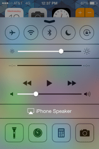
Fixing what is perhaps one of iOS’ most glaring, long-lasting omissions, iOS 7 puts one-click access to things like Airplane mode and Wi-Fi/Bluetooth toggles just one swipe away, instead of hiding them in settings.
To get to the new Control Panel, just swipe up from the bottom of the screen anywhere you might be. You’ll get buttons for Airplane mode, Wi-Fi, Bluetooth, Do Not Disturb, Orientation lock, and sliders for brightness and media control. Oh, and there’s a flashlight in there. So if you were thinking about building a dedicated flashlight app, now is probably not a good time.
(Pro tip: The control panel is available from the lockscreen. Also: if the control panel is sliding out and interrupting your Candy Crushin’ time, you can block it from sliding out while in an app in your settings.)

Reveal iMessage and SMS Timestamps:

timestamp
iOS has always been kind of weird about telling you when a message was sent or received. It’ll tell you when some messages came through — but only if it’s the first one that’s come through in a while in a given thread. If you sent a bunch of messages around 12:45, for example, you’d normally only get that first 12:45 timestamp.
With iOS 7, you can reveal the timestamp for each and every message. Just grab one of the speech bubbles in a thread and swipe to the left. Tada! Timestamps! Never argue about exactlywhen a message was sent again! (Because, yeah, I’ve had those arguments. Seriously. Sigh.)

Built-In Level:

level
Building a house boat? Hanging a picture? Just want to show off one of the stranger new tricks that your iPhone has picked up?
iOS 7 has a built-in bubble level, of all things. I thought it was a pretty strange addition at first… but then I found myself using it one day. Then again the next.
To get to the level, open the compass app. Though not immediately obvious, there’s a second page to the app; swipe to the left, and you’ll be at Apple’s level.
(Pro tip: Double-tapping the screen resets the level to consider whatever angle the phone is currently at to be 0°. That design choice, expressed through a series of colored flashes, isn’t super intuitive.)

Swipe To Close Safari Tabs:

tabs
Safari has a new, scrolling 3D tab interface that allows for just about as many tabs as you want.
Alas, these tabs also have new, tiny “X” buttons that make closing them quickly a bit of a pain.
Forget the X button — it’s for chumps. Swipe the tabs away to the left, instead. It’s a whole lot faster, and requires less precision when you’re trying to dump a bunch of tabs on the go.

Call/SMS/Facetime Blocking:

Blocked
“Surely, there’s got to be a way to block phone numbers,” said every iPhone user ever.
Really, just type “How to b” into Google and let it autocomplete. First result? “How to block a number.” Second result? “How to block a number on iPhone.” Third result? “How to be happy.” This feature is in greater demand than happiness! Happiness!
Yet, until now, there hasn’t really been an easy way.
With iOS 7, it’s finally a pretty straightforward process to block people from calling, messaging, or FaceTime-ing (FaceTiming? Facing? Agh.) you. You can find the block list at either Settings > Phone > Blocked; Settings > Messages > Blocked; or Settings > FaceTime > Blocked. Note, however, that the block list is universal — block them in the phone settings, and they’re blocked on FaceTime, too.

App-By-App Cell Data Usage/Blockage:

Cell
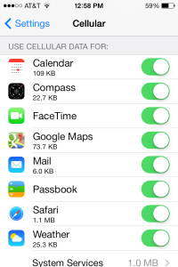
Want to see which app is using up all of your cell plan’s precious megabytes? Want to keep Pandora from streaming unless it’s on Wi-Fi?
Pop into Settings > Cellular and scroll down to the bottom. You can see which apps have used the most cell data and block any app from using cell data at all. (Note: An app needs to have used cell data at least once for it to show up in the list.)

How To Close Apps:

photo
We’ve had a bunch of requests for this one since this post first went up, so here you go.
Apple changed the App Switching/App Closing mechanism up a bit with iOS 7. It used to be that to close an app, you’d double tap the home button, wait for the app drawer to slide out, then press and hold on an icon until the little “X” appeared.
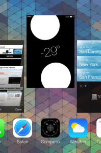
With iOS 7, the whole thing looks and works a bit more like webOS of yesteryear. Double tap the home button to bring up the fullscreen app switcher, which provides a screenshot of each running application in a sideways-scrolling carousel. To close an application, simply swipe the app’s screenshot up and off the screen.
(Note: You really shouldn’t need to close apps all that often. Unless the app has crashed and refuses to fix itself or it’s doing something that is eating your battery, iOS 7 is designed so that most apps use little to no resources when in the background.)


Bonus Tricks:
  • Folders can now be paged, allowing them to hold a huge number of apps.
  • Safari still has private-browsing mode, it’s just in the app itself now instead of hidden away in settings. Find the switch in Safari’s tabs screen.
  • Airdrop, Apple’s much touted system for wirelessly transferring files to other nearby iPhones, only works with the iPhone 5 and later. (I’ve spotted many a 4S user wasting time trying to figure out how the heck to turn it on, when the option simply isn’t there for them. Don’t worry, I wasted a good 10 minutes myself.)
  • Miss the “List” view in the calendar app? It’s still there, just not immediately obvious. Tap the search icon to bring up a scrollable list.
  • If you’re into using default ringtones, give Apple’s list another look. They’ve added a bunch of new trancy ringtones and chiptuney text alerts.
  • Siri has picked up a bunch of new tricks. You can toggle settings (“Turn On Do Not Disturb”), ask for recent tweets (“What is TechCrunch saying?”), show you pictures (“Show me pictures of cats”) pulled from Bing, provide Wikipedia info inline (“Tell me about TechCrunch”), post to Facebook, play back voicemail, list recently missed calls, and find restaurants on Yelp and make OpenTable reservations.
  • iOS 7 keeps tabs on where you hang out most, allowing it to cache relevant nearby data. It’s neat, if a bit spooky. Once you’ve used iOS 7 for a while, go to Settings > Privacy > Location Services > System Services to view a list of your frequent haunts. You can also turn this feature off at the same location.
Know any other tricks that we should list? (“LOL SWITCH TO ANDROID” doesn’t count.) Drop a comment and we’ll add the best.

Courtesy: TechCrunch

Sep 28, 2013

Apple's iOS 7 is reportedly making some users sick

Apple's new iOS 7 for the iPhone and iPad is reportedly making some users sick due to new transition, zooming, animation, parallax scrolling, and more

Apple's new operating system, iOS 7, features new transitions with frequent use of zoom and slide animations, icons floating above moving wallpapers, and parallax scrolling.

iOS 7 for iPhone and iPad launched globally on Sep. 18 and reportedly around 18% of iPhones and iPad users installed the update within 24 hours, with some saying 35%.

Although now it appears some of these new features could be causing sickness in some users.

According to The Guardian, users who suffer with motion-sickness, vestibular disorders, central dizziness and other conditions are among the users that may be affected by Apple's triggers, parallax scrolling, and frequent screen movement.

Cynthia Ryan, executive director of the Vestibular Disorders Associations, told The Guardian that 3D effects can cause "intense nausea, dizziness and vertigo".

Alongside this, Matt Gemmell, an independent iOS developer, commented that uers with such conditions "would find some parts of the new iOS 7 interface uncomfortable or disorienting," because of th eexcessive user of animations.

There is a "Reduce Motion" option in Settings for iOS 7 but that simply turns off parallax not the zooming, and/or sliding.

Apple is yet to comment.

Source: The Guardian

Courtesy: T3

Sep 27, 2013

How to adjust visual effects in iOS 7

Question. I'm not so sold on some of the visual effects in iOS 7. Can I turn any of them off?

Answer. When Apple shipped this update to its mobile operating system, I thought most complaints would come from iPhone, iPad or iPod touch owners who had an iOS 7 install go wrong or break some older apps.

Instead, some people just don't like the way icons in iOS 7 zoom, bob and weave in response to your taps of the screen, or even just how you tilt it.

STORY: Apple's iOS 7 update making some users dizzy

The most serious objections come from users who report feeling nauseated by the way apps rush in and out at you as you open and close them or jump in and out of folders. A few others have voiced lesser gripes about the finer points of this jumpy behavior — for instance, the way app icons seem to tumble back into the desktop after you close an app with a pinch gesture.

But at the moment, you can't suspend those animations. Apple doesn't include a setting in iOS to turn them off.

You can, however, disable a less controversial iOS 7 feature: the "parallax effect" through which the home-screen background appears to move underneath app icons as you tilt the device left, right, forward or back.

(Wired contributor Rhett Allain calculated that parallax simulates a gap of .197 cm between apps and the background.)

If you find that gimmicky, you can shut it off in a non-obvious corner of the Settings app: Open that, select General and then Accessibility, then tap "Reduce Motion" and slide that button to the right.

Maybe Apple will add other settings to adjust iOS 7's visual effects, but I wouldn't bet too much money on that happening.

One of the things that Apple has historically done well is sacrificing flexibility for simplicity. For instance, Windows lets you adjust some 20 different visual effects, while OS X lets you adjust little beyond a few Dock animations.

Other companies may be taking note: Windows Phone and the Google-standard version of Android offer little more control over animated effects than iOS, although neither has apps appearing to fly in and out of the screen in the way they do on an iPhone or iPad running Apple's latest.

For whatever it's worth, I don't have any issues with iOS 7's effects; even if the parallax effect is not exactly functional, it still looks neat.

But what really sold me on iOS 7 was a less-discussed change: It allowed most phone-sized apps to run full-screen on my iPad mini without looking crudely bitmapped. If you've avoided some apps that only came in iPhone versions on your iPad 2 or mini because of their misfit appearances under iOS 6, try them again after upgrading.

TIP: YOU CAN JUDGE AN ANDROID APP BY ITS RELEASE NOTES

One of the less-understood differences between iOS and Android is how each system handles giving an app the keys to your data. In iOS, apps don't have to state upfront how much access they want, but they do have to ask permission every time they reach for such sensitive information as your location, your contacts or your photos.

In Android, however, apps have to state their intentions before you install them. A permissions dialog specifies any of dozens of areas from where an app can get data; once you approve that list of requests by tapping an "Accept" button, you get no further notice of its activity.

But not all of these permission requests can be easy to read and understand. Some can look vague or worse: Why, for instance, would the Lookout security app want the ability to send text messages?

The answer is waiting in the "What's New" section of Lookout's release notes, displayed when you install or update the app, which feature an explanation of this change: "Requesting 'Send SMS' permission to enable carrier billing for users who purchase Premium in the United States."

Developers who take the time to explain to their users why their app's appetite for data increased -- or, better yet, note when they've been able to make an app simpler and safer by removing a permission request -- get a little extra credibility in my book. They should in yours, too.

Courtesy: USAtoday


Powered by Blogger.


© 2013 Technology Update News!. All rights resevered. Designed by BDpython

Back To Top