Beyond "benchmark boosting," the Note 3 needs some software solutions ASAP.
by Ron Amadeo
Big is back! The pocket-filling Galaxy Note returns with a third iteration, and Samsung has one-upped just about every item on the Note II spec sheet with this sequel. While we see the return of the 2.3Ghz Snapdragon 800, the benchmarks aren't just a carbon copy of what we saw with LG's G2, thanks to some odd CPU governor settings.
Specifically, Samsung appears to be giving preferential treatment to benchmarking apps. Through some testing, we've found the CPU runs in a special high-power mode whenever a popular benchmark app is loaded. But before we get into that, let's talk about the device itself. The Note 3 is Samsung's "everything but the kitchen sink" product, so there's a ton to go over: the S-Pen, Touchwiz, multi-tasking, a new sub-pixel layout, USB 3.0, and of course, a screen the size of a small table.
| SPECS AT A GLANCE: SAMSUNG GALAXY NOTE 3 | |
|---|---|
| SCREEN | 1920×1080 5.7" (388 ppi) Super AMOLED touchscreen |
| OS | Android 4.3 "Jelly Bean" |
| CPU | 2.3GHz quad-core Snapdragon 800 |
| RAM | 3GB |
| GPU | Adreno 330 |
| STORAGE | 32GB or 64GB |
| NETWORKING | Dual Band 802.11b/g/n/ac, Bluetooth 4.0, GPS |
| FREQUENCIES SUPPORTED | GSM: 850 / 900 / 1800 / 1900 MHzHSPA: 850 / 900 / 1900 / 2100 MHzLTE: up to 6 different band sets (Dependent on market) |
| PORTS | Micro USB 3.0, headphones |
| CAMERA | 13MP rear camera, 2MP front camera |
| SIZE | 151.2mm x 79.2mm x 8.3mm (5.95" x 3.12" x 0.33") |
| WEIGHT | 168g |
| BATTERY | 3200 mAh |
| STARTING PRICE | $299 with 2-year contract |
| OTHER PERKS | Removable battery, MicroSD slot, RGB Notification LED, IR blaster, 4K video recording. MHL 2.0 |
Let's get the obvious out of the way—the phone is big as hell. The size of the Note family has always been extremely polarizing, and the Note 3 is no exception. While showing it to friends and family, it got reactions ranging from "joke-big" and "Zack Morris" to instant gadget lust. The Note 3 is also quite the attention getter—whenever I take it out in public a few people always come up and ask what it is. We'd advise against buying a big device like this sight-unseen. Either go experience it in a store, ask a friend, or (apparently) approach a stranger (at your own risk*). The bottom line is be familiar with the size of the Note 3 before diving in.
Display
It may seem impossible, but the screen on the Note 3 has gotten even bigger. It's up to a whopping 5.7 inches, 0.2 inches bigger than the Note II. The good news is that the extra screen space doesn't come at the cost of a larger device. Samsung found room by slimming down the bezels. While the LG G2 is still the tiny-bezel champ, it's nice to see Samsung improving here. Ultimately the bigger screen makes the phone look even bigger, which is either really awesome or really not awesome depending on which side of the is-it-too-big debate you fall on.

Diamond Pixels at various zoom levels.
The negatives of Pentile still remain. There are still 33 percent fewer subpixels when compared to a full-matrix display. The Note 3 display is definitely not as nice as something like the HTC One, which has a better subpixel layout and a higher pixel density (468dpi for the One verses 386dpi for the Note 3), but it's not completely outclassed either. There is still some checkerboarding on sharp edges from the missing subpixels. In the right image you can see how the checkerboard pattern shows up in the search app. The pixels are so small now, though, that this is very hard to notice.
Design
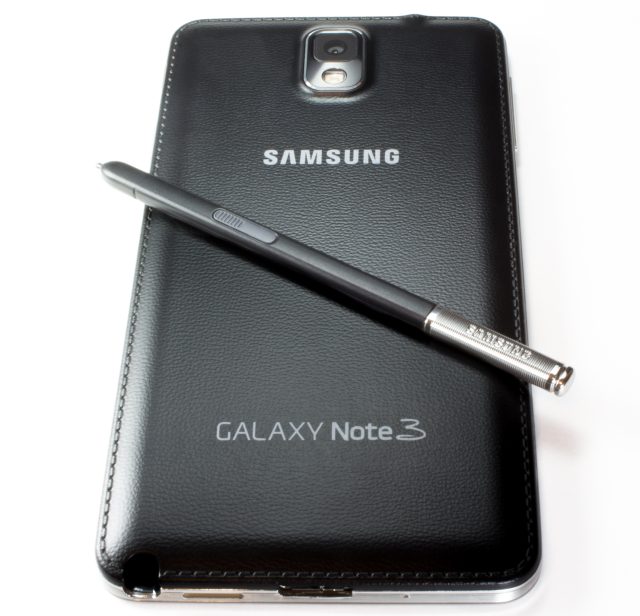
The faux leather back and S-Pen
The S-Pen is still here too. While Samsung is clearly trying to ditch the "cheap-plastic" feeling on the exterior of the phone, they haven't done anything to help the feel of the S-Pen. It's made out of the chintziest plastic imaginable. It's so light that it feels disposable, like something you're supposed to throw out after every use. I would have preferred something closer to the nice heft of a metal pen, but this is basically a hollow plastic tube with a button on it. It just seems odd using your $700 device with a 25¢ pen.
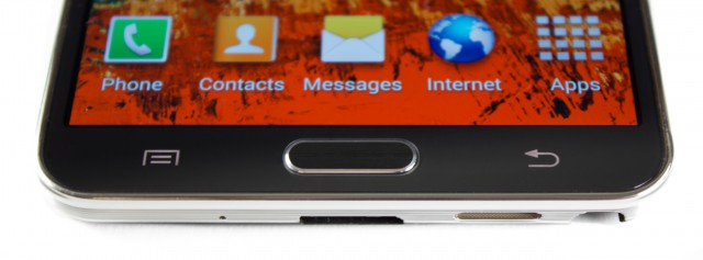
The button layout. The capacitive buttons now work with the S-Pen.
The buttons now have so many functions; they are often hard to keep straight. For the home button, a single tap goes home, a long press opens recent apps, a double tap opens S Voice, and a single tap while already on the home screen will open "My Magazine," a branded version of Flipboard. A single press of Back will, of course, go back, and a long press will open the split screen app drawer. A long press on Menu will open Samsung's search app. Got that?

The side.
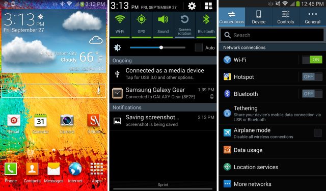
There's nothing too out of the ordinary along the sides; a power button on the right and volume buttons on the left. One of the most irritating things about Touchwiz is that Samsung disables the power + volume down key combination for taking screenshots. The only way to save a screenshot is to swipe your whole palm across the screen and hope that doesn't trigger any touch events or gestures. This may be more of a problem for journalists than anyone else, but journalists are people too.
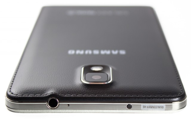
The top with a headphone jack, microphone, and IR blaster.
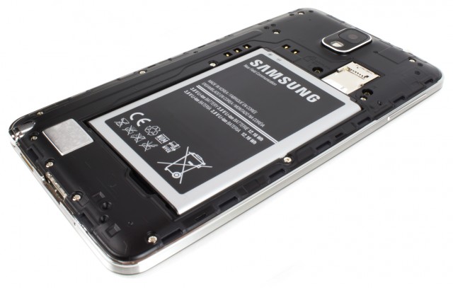
The Note 3 with the back removed.
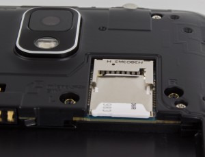
The stacked MicroSD and SIM slots.
MicroSD slot. The back cover has been made to be as thin as possible, so much so that first timers are usually afraid of breaking it. It's quite flimsy, and if you didn't realize the back was plastic before you took it off, you will definitely realize it afterwards. Once the back is off, the 3200mAh battery pops right out. With the cover removed, you can see several gold connectors around the top-left corner of the battery, which are no doubt for a forthcoming wireless charging back piece. Another interesting design touch is the layout of the SIM and MicroSD slot—they're stacked on top of each other! Who knew Samsung would opt to save board space like this on a phone this large?
Along the bottom is a spot for the S Pen, a speaker, Micro USB port, and Microphone. The speaker is almost uncomfortably loud at max volume, which is a very good thing. It's not going to top something like the HTC One, with its dual front-facing speakers, but it's a solid performer.The Note 3 is the first smartphone to support USB 3.0, which means if you've got the right equipment, you'll get blazing fast file transfer speeds. In most devices, the bottleneck during computer-to-phone communication is the USB 2.0 connection. But with USB 3.0, the Note can receive files as quickly as the internal storage can handle. I was able to transfer a 9GB movie to the Note 3 over USB 3.0 in two minutes; moving the same file to the Note over USB 2.0 took four minutes.
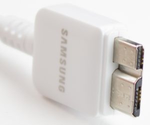
The included Micro USB 3.0 cable.
Theoretically, another benefit of USB 3 should be faster charging from a computer, but the phone only says "USB Charging" (as opposed to the faster "AC charging") when hooked up. The max draw from a USB 3.0 port is still only 1.5amps, while the included charger is rated at 2amps. For the fastest charge, you'll still need a wall outlet. Micro USB 3.0 works by adding additional pins to the side of a MicroUSB 2 port, meaning the connection itself is just longer. The good news is that everything is backwards compatible—a MicroUSB 2.0 cable will still fit in the port, it just doesn't use every pin. Samsung has included a fancy new Micro USB 3.0 cable (pictured to the right) with the Note 3, but it's nice to know that if you don't have it, your old stuff will still work.
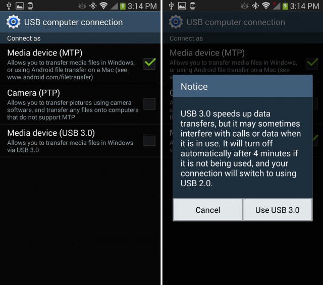
Samsung's USB settings.
Touchwiz
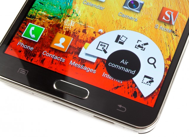
Air Command
"Air Command" is the feature du jour for this version of Touchwiz. Just take the pen out, or hover above the screen and tap the S-Pen button, and a radial menu will appear with several S-Pen-centric options. The first is "action memo," a pop up notepad that will attempt to make sense of your scribbles with handwriting recognition. The "action" part of "Action memo" comes from the ability to pass what you've written to other apps. You can call a written phone number or move the text to the e-mail app, texting app, Web browser, maps, or task list. Writing down and calling phone numbers works, but everything else is really finicky. So much has to go right for it to be useful: it has to properly recognize your handwriting and detect which field in the app your text should go into. For e-mails, for instance, it will usually paste the entirety of what I've written into the "To:" field.
The other shortcuts in Air Command have been in the Note II in some form or another. "Scrap Booker" will save a screenshot of whatever you circle on the screen, and it will try to include metadata like the URL of the website if you're using the browser. "Screen Write" will take a picture of the screen and let you write on it. "S-Finder" is Samsung's universal search, and this will even preform handwriting recognition on all your notes, index them, and include them in search results.
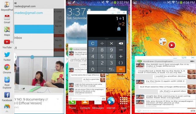
Left: Split screen apps. Center: Floating window apps. Right: Minimized floating apps and really bad horizontal stretching.
Performance for the split screen apps is fantastic. You can rapidly switch between apps without a delay, and you can do things like play a movie in one half of the screen while working in the other without any slowdown. This is a big improvement over Samsung's first version of split screen, which would have a large delay when you moved between the top and bottom apps.

A floating YouTube window.
Removing the "draw a box" step would have been a good idea, because right now it slows you down and just feels like a gimmick. Unlike split screen apps, support for this is very limited. On my device, the only options were Calculator, Clock, YouTube, Phone, Contacts, Hangouts, and Internet. The silliest thing about the floating windows is that the shape you draw has to be a perfect 16:9 aspect ratio, or your app will be stretched out and distorted. In the right picture, you can see that Hangouts is stretched so much horizontally that the text is difficult to read. You can resize the windows after the fact, but that just means you spend more time fiddling with the interface than actually doing what you need to do. YouTube is particularly bad. In portrait mode, the floating app window will only display in portrait, so even if you hit full screen on the floating window, you have a portrait 9:16 window with a landscape 16:9 movie inside of it. There's no way to display YouTube without the massive black bars, and remember, in portrait mode, apps need keep a portrait 9:16 shape or they will be distorted. Floating apps can be minimized and will shrink down to floating "chat head" bubbles when you press the minimize button or the home button, which you can see in the top right picture. These will float on top of any other window until you close them.
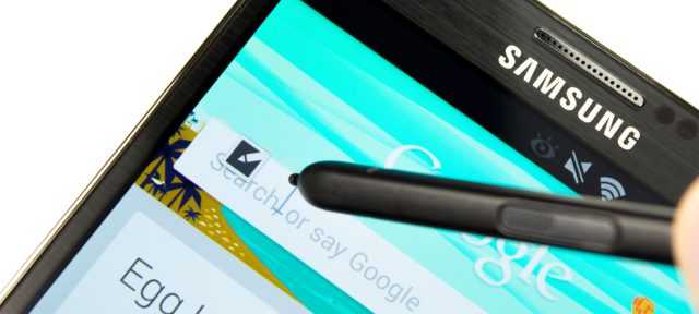
Direct Pen Input: Just tap this icon and you can write in any text field.
One of the most shocking blunders in the software department is the Gallery, which is literally unusable with the default settings. In the smartphone world, an app taking one second to launch is considered slow, but the Gallery on the Note 3 takes anywhere from 15 seconds to two minutes-plus to open. Albums take another 10 to 30 seconds to open. While this loading is happening, scrolling and touch screen input often just don't work. The video below shows how crazy this is.
The issue is that Gallery on the Note 3 wants to display all the pictures on your phone, plus everything from Google+, plus everything from Dropbox. It just can't handle that many pictures. The device has been synced for several days, and it takes forever even with Airplane mode on, so it's not a data issue. While all this loading is happening, System Monitor shows a light CPU workload, almost no disk I/O, no network activity, and no change in RAM usage. We're really not sure what is taking so long. If you go to the settings, turn off Dropbox pictures and clear data, the Gallery goes from "completely unusable" to just "slow," but at least it will work without a multi-minute delay. I'm only using about 5GB of Dropbox storage, and the Note 3 comes with a 50GB Dropbox storage boost, so it's not like I have a crazy amount of data in my account. Having a quad-core 2.3 GHz beast of a phone turn in this kind of performance is kind of sad.
Camera Samples
The Note 3 has a 13MP camera that can put out some really great pictures. The other added bonus is 4K video recording, which pump out 3840×2160 video for as long as your storage can handle it. A one minute 4k video from the Note takes up about 350MB. Here are a few samples from the camera:


My dog on a cloudy afternoon.
The camera makes the best of bad indoor lighting.

A shadowy city.

Everyone else takes pictures of food, so why not?
Performance, benchmarks, and benchmark "optimizations"
The Note is packing a whopping 3GB of ram and a 2.3GHz Snapdragon 800. We covered the differences over the Snapdragon 600 in the G2 review, but for a quick recap, you're moving from Krait 300 to Krait 400 CPU core, which can run faster and more efficiently thanks to TSMC's new 28nm HPM process.
In terms of performance, the Note 3 is not what I would call "blazing fast." We've run into all sorts of stutters in animation and even outright pauses while testing it. While the hardware is top of the line, Samsung appears to have pushed the software envelope a little too far this time, and it doesn't feel as responsive as other modern Android phones. We've even run into weird error messages like "low memory" warnings when opening GFXBench, despite the 3GB of ram and Android's automatic memory management. While the phone itself sometimes pauses, Samsung isn't helping itself in the "perceived responsiveness" department either, thanks to the way the home button is implemented. You can press it twice to open up S-Voice, which means when you press it once to go Home, it waits for half a beat to make sure you aren't going to press it again to load S-Voice. When the phone temporarily locks up, and you frustratedly hit the home button hoping it will wake up and load, every additional home screen press is launching some kind of app or feature that isn't the homescreen. This probably makes things worse. I've accidentally opened Flipboard (by pressing the home button while on the home screen) so many times I've lost count. Thankfully, if you go into the options of S-Voice and Flipboard you can turn off the home button integration, which removes the half second pause.
Some benchmark irregularities
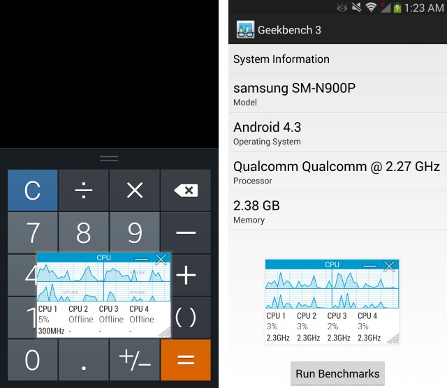
Left: The Note 3 idling normally, with 3 cores off. Right: The Note 3 in a benchmarking app, unable to idle.
The benchmarks for the Note 3 are a story in and of themselves (and we'll spin some more on them into a separate post soon). In some tests, the Note 3's 2.3GHz Snapdragon 800 blows the doors off the G2's 2.3GHz Snapdragon 800, and that doesn't really make any sense. We've noticed that if you open a benchmark app, the four cores immediately wake up, switch over in to 2.3GHz mode, and stay on even if you are idling. A normal idle is one core on, three cores off in 300Mhz mode, not all four cores running at maximum power. Samsung's CPU governor appears to be aware of when you are in a benchmark app, and it spins everything up to maximum power. This happens in almost every popular CPU benchmark app: Geekbench 3, Antutu, 3Dmark, Vellamo, and Quadrant.
Samsung did something similar with the international Galaxy S4, but this is the first time the setup has shown up on US soil. A function called "benchmark booster" would increase the GPU frequency when in a benchmark app or while using the camera. We were unable to replicate this CPU boosting behavior in any of the stock apps or for 3D games like Shadowrun, Madden, or Minecraft—it seems to be a special CPU mode just for benchmark apps. The whole point of a benchmark is to quantify how fast the phone will be during normal use, not to get the highest benchmark score. Having any kind of special CPU mode for benchmarks seems to defeat the purpose.
Faking out the phone
We use Geekbench as our CPU benchmark app, and this is one of the apps that has the suspicious CPU behavior on the Note 3. To fix this, we created "Stealthbench"—it's the Geekbench app with a different package name.
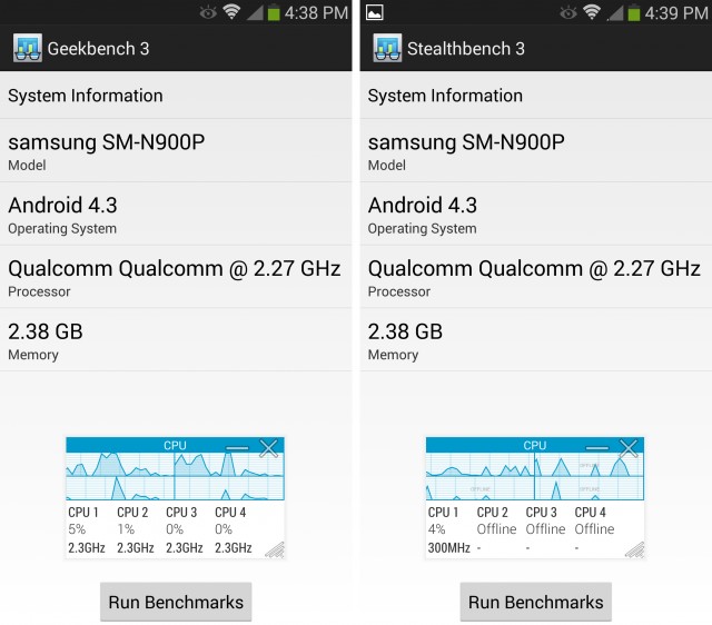
Left: Geekbench running in the boosted CPU mode. Right: Our modified version of Geekbench that allows the CPU to function normally.
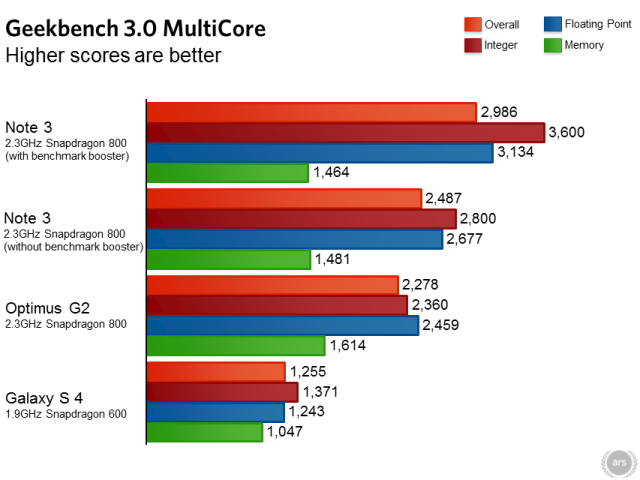
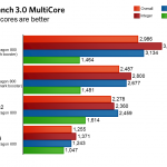
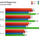
In the screenshots above, you can see how the Note 3 treats Geekbench and Stealthbench differently, even though they're identical in all but name. Geekbench is a popular benchmark app, and when the Note 3 runs it, the CPU will only idle at 2.3GHz. All four cores stay on. The Note 3 has never heard of "Stealthbench" though, so even though it is exactly the same app, the CPU is allowed to idle normally, cores turn off, and the clock speed drops down to 300MHz. When you change the internal name of Geekbench, you break Samsung's benchmark detection. This tricks the Note into running Geekbench as it would any other app. So in our CPU benchmarks you will see the Note 3 listed twice—once running normal Geekbench with the benchmark booster on, and again running Geekbench with the benchmark boosted defeated.
Performance benchmarks suites
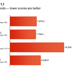
As you can see from the two Geekbench charts, the Note 3 gets drastically different benchmark scores just by changing the name of the app. Change "Geekbench" to "Stealthbench" and the scores drop down to LG G2 levels, which, given the identical SoCs, is more in line with what we were expecting. In the multicore test, Samsung is giving themselves a 20 percent boost in score with their benchmark detection scheme. While merely idling the CPU cores at max power won't lead to this high of a jump in scores, it's clear Samsung changes the way the CPU functions when it knows a benchmark app is running.
Javascript benchmarks
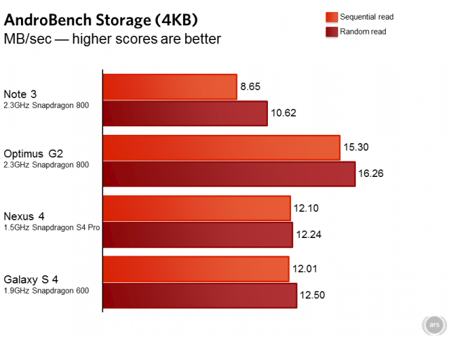
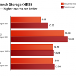
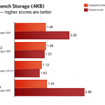
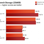
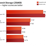
Storage benchmarks
Battery life
Top-of-the-line everything, but the software needs work
If the Galaxy S 4 is Samsung's everyman product, the Note 3 is the "everyone else" model. It's a collection of disparate features mashed together in a single device, yet it somehow works. Some people are here for the huge screen and don't care about anything else. Other people are handwriting enthusiasts or artsy types who want a stylus, and the giant screen is just a bonus. Others will be interested in the monster spec sheet featuring a 2.3Ghz Snapdragon 800, 3GB of RAM, USB 3.0, and the ability to multitask.
The benchmark shenanigans are disappointing, especially given the fact that the Note 3 will still beat the G2 in a fair benchmark fight. It shouldn't change your perception of the phone, though. Outside of the benchmark apps, the CPU functions normally. We're still waiting to hear back from Samsung on just what the deal is with their CPU settings, and we'll share their comments as soon as we can. Jason Inofuentes reports similar behavior in the Note 10.1 2014 edition, so this isn't just a one time thing.
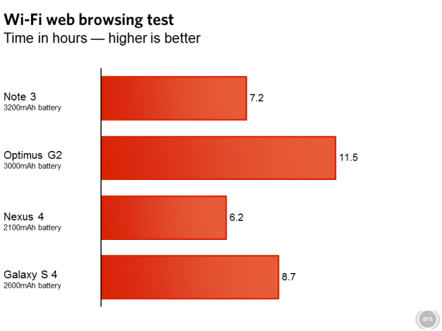
While the hardware is great, and even Samsung's plastic backing is much improved, much of the Note 3's software feels unfinished. The gallery is unusable out of the box and needs to be fixed, and the phone doesn't feel as smooth as it could be. With such a huge battery, the Note 3 should last a few hours longer in our tests, especially given what the G2 can accomplish with a smaller battery and a slightly smaller screen. We've got to wonder what the Note will look like after it gets a few OTA updates under its belt.
For now you're buying the Note 3 and trusting Samsung to fix the performance shortcomings (and we'll keep our eyes out for any upcoming fixes). For those of you that knew you were buying the Note 3 before you even read this article: knock yourselves out. For everyone else, it's probably best to wait and see what the OTA fairy brings.
The Good
- A gigantic 5.7 inch, 1080p display
- The faux leather and chrome combo makes for a great looking device
- A removable battery and microSD slot
- USB 3.0, while clumsy, is great to have when you really want to transfer a huge file
- Touchwiz gives you a million ways to multitask that you can't get anywhere else
The Bad
- Disappointing battery life
- A Menu button. This hides all the overflow menus you should normally see and is terrible for discoverability
- Touchwiz still looks and functions like Android 2.3. You can't horizontally swipe between tabs, there are hidden menus that are a mile long, and everything looks rather dated
- The occasional animation stutter for seemingly no reason
- Artificially boosting benchmark performance is not a good thing
The Ugly
- They can include a function to boost benchmarks, but they can't fix the multi-minute load times on the Gallery app
Courtesy: arstechnica



0 comments:
Post a Comment