Three years wasn't enough time to get this massive IT effort past the finish line.
by Sean Gallagher
by Sean Gallagher

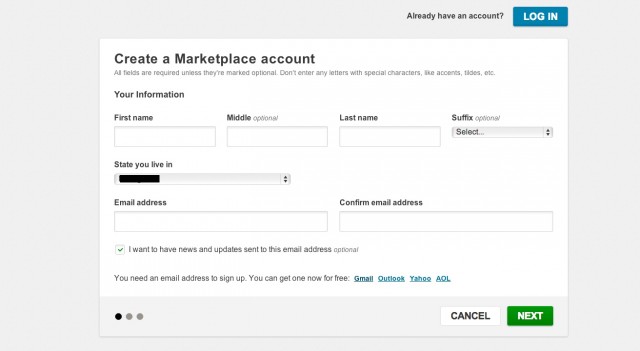
Getting to this page on the Healthcare.gov site is just the start of the battle for would-be insurance customers.
Sean Gallagher
Amid all the attention, bugs, and work happening at Healthcare.gov in light of the Affordable Care Act, potential registrants talking to phone support today have been told that all user passwords are being reset to help address the site's login woes. And the tech supports behind Healthcare.gov will be asking more users to act in the name of fixing the site, too. According to registrants speaking with Ars, individuals whose logins never made it to the site's database will have to re-register using a different username, as their previously chosen names are now stuck in authentication limbo.
The website for the Affordable Care Act (aka "Obamacare") launched just last week. With all the scrutiny and debate happening, if ever there was a website launch that was "too big to fail," this was it. So, of course, it did—depending on how you define "failure." The inability of Obamacare portals to keep up with the traffic demands initially put upon them has been seized by politicians and conservative pundits as evidence that Obamacare "is not ready for prime time" in the words of Sen. Orrin Hatch (R-Utah). Now, a week later, the site appears to be stabilizing, with waiting times dropping dramatically for those who haven't been able to register before.
A test of the site this morning had me waiting four minutes to get to the signup page; others got on instantly. But problems persist beyond the front door. The contractors responsible for the exchange—CGI Federal for the website itself, Quality Software Systems Inc. (QSSI) for the information "hub" that determines eligibility for programs and provides the data on qualified insurance plans, and Booz Allen for enrollment and eligibility technical support—are scrambling to deploy more fixes. Technical support call center operators continue to handle an onslaught of calls from users who can't get back into the system after registering.
In addition to would-be Healthcare.gov registrants notifying Ars about the password reset and login limbos, Ars learned that changes made to profiles already within the system may not be saved either—a problem that is only indicated by a very non-descriptive error message.
Ars attempted to contact the contractors with Healthcare.gov but did not receive a response as of this writing.

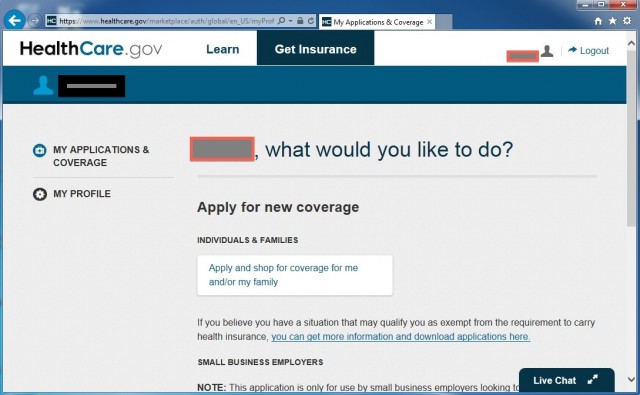
Healthcare.gov's profile page, where you provide your personal data, may not save changes you make...

But the only hint you'll get about it is this error pop-up.
Three years is not enough
CGI has had some experience with these exchanges in the past. It built the Web portal for Massachusetts' "Romneycare" and is building exchanges for a number of other states. So with that experience behind them, why, with three years to prepare, did these sites have such a rough first week?
Those familiar with how Federal IT projects usually roll will suggest an alternative question: with three years to prepare a system that is expected to cost $683.81 million—and much of that preparation being bureaucratic haggling over the rules for its operation—how did the Department of Health and Human Services (HHS) and CGI manage to get anything up at all?
Federal IT projects are infamous for blowing out the "iron triangle" of project management—cost, scope, and schedule. Healthcare.gov hits all three sides of the triangle. Because of the legislative mandate for Healthcare.gov and its state-run cohorts, the project was handed a massive scope. With Congress eager to cut its throat, the program has been highly budget-sensitive. And with a hard deadline of October 1 and a heavy up-front regulatory process required to create the specifications for the portal, three years was a very tight deadline.
Based on the Federal IT Dashboard, which tracks the project status and risk for most of the federal government's major IT programs, it would appear that HHS and the Obama Administration were relatively confident that the exchange sites would launch on time. However, they were less confident about it coming in under budget. Known as the "CMS CCIIO Healthcare Insurance Exchange IT Investment," the program was assigned a "medium risk" evaluation (A "3" on a scale of 5) at the end of July. That rating wasn't because there was concern about the schedule. Instead, the risk rating was assigned because HHS' Chief Information Officer Frank Baitman was concerned about potential cost overruns for the website implementation.
There were even earlier causes for concern. Back in March, concerns about the funding levels for the program prompted Baitman and HHS management to rate the program as "high risk"—giving it a score of 1 out of 5. In June, the Government Accountability Office, the nonpartisan auditing body that provides oversight reports to Congress, said that it was still a crapshoot as to whether the system would work on time. This uncertainty persisted because the hub being built by QSSI still hadn't been completely tested (the hub is responsible for making automated decisions about eligibility). While the policies to govern how the hub works—and how various state systems were supposed to work—had been completed, there was still a lot of code to be written to make those policies into an actual system.
All of that pushed the development of the system closer and closer to the deadline. As one reddit user posted when the site ran into trouble on October 1, "My wife works on this project but not as a developer. Last night she said, 'I have no idea how the site is going to go live tomorrow.'"
Garbage in, garbage out
The result of the headlong rush to October 1 was a system that had never been tested at anything like the load it experienced on its first day of operation (if it was tested with loads at all). Those looking for a reason for the site's horrible performance on its first day had plenty of things to choose from.
First of all, there's the front-end site itself. The first page of the registration process (once you get to it) has 2,099 lines of HTML code, but it also calls 56 JavaScript files and 11 CSS files. That's not exactly optimal for heavy-load pages.
Navigating the site once you get past registration is something of a cheese chase through the rat-maze. "It's like a bad, boring video game where you try to grunt and hack your way through to the next step," one site user told Ars.
Once you get through all that, it’s not clear that it's going to do you any good. Underlying problems in the back-end code—including the data hub built by QSSI—have been causing errors in determining whether individuals are eligible for subsidized plans under the program. In DC, that means health care plan prices won't be available to people registering through DC's portal until November. It may also mean that others who have registered already at the federal and state exchanges may get sticker shock later.


0 comments:
Post a Comment