
In the last Tech Now we showed you a few great free sites to help you build your own personal or small-business website. I'm about to give you some fresh advice on what to put on your new website, but before we dive in, I want to introduce you to a new website creation tool, that "strikes" me as one of the simplest of all to use: Strikingly.
Until today, I had never heard of this particular site-building service. Within 10 minutes of opening it for the first time, I had created a fairly decent new personal site. Best used to launch simple websites for digital résumés, events and start-up projects, Strikingly's mobile design and simplicity are its biggest strengths. It provides gorgeous templates, so all you have to do is type in your personal information, then cut and paste photos or upload video. It's crazy-easy for the basic services. I also really like that this turnkey site takes a "mobile first" approach, so that you don't have to worry about how your website looks when someone pulls it up on a smartphone or tablet. Thank you, dear readers and viewers, for putting Strikingly on my radar.
PART ONE: How to make your own website for free
Now, what to put in — and what to leave out of — your personal website:
Knowing how to create a quick online billboard is one thing, but exactly what should your site have to put your best face forward in the digital world and beyond?
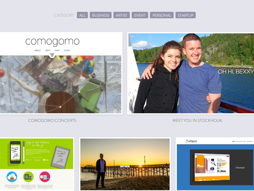 |
| A sample website (Photo: Jennifer Jolly for USA TODAY) |
The Do's:
In general, your site should be unique and represent you — in a truly tasteful way that significant others, like your future mother-in-law, will be OK with down the road. College students, I know it's hard to believe that something you think, say or do at 19 or 20 would embarrass you — or even cost you a job — later in life but it does, and will. It's easy to shine when you truly are creative, without losing what makes you special. Here's a checklist that the folks at Weebly helped us create for this series:
1. Consider your target audience
Before you even sign up and log on, consider who you are trying to reach. Who do you want to find your site, and what do you want them to know about you, your products, ideas or services? Always consider, "what's in it for them." Give people a reason to find your site, and pay attention to what you have to share.
2. Come up with a well-written summary of your background that covers:
• what have you done
• why have you done it
• what you want to do next
• and the most important bullet point of all … why should anyone care?
Consider how you can show, not just tell, your Web audience the answers to the above. How can you solve a problem for your audience? Keep the jargon low and read what you've written out loud to help keep it simple and concise.
3. Showcase samples of your best work
We all know a picture is worth a thousand words, so use photos and video to truly showcase your expertise. You can also use an essay, competitive analysis, or even your unique point of view on a topic to help stand out from the crowd.
The Don'ts:
Don't create a website that's cluttered, riddled with typos, or makes the audience work too hard to find the information they need. Here are more of the top mistakes to avoid:
1. Ruin the aesthetic with ads
I'll be totally honest, there's a really good chance no one wants to place banner ads on your personal website. So this advice is more for small-business sites. Pop-up ads should be shot. I have never, ever, ever clicked on one. They turn me off and send me away from your page. Well-written content and compelling calls to action convert a whole lot more site visitors into customers than all that other junk.
2. Use "selfies" or stock photos
As my 12-year-old is fond of saying, "no offense but…" if you use an old, over-styled (a modeling-wanna-be shot when you're a recent grad wanting to get into accounting), goofy or staid stock image, you're turning off potential visitors. Take the time and make the investment to let the images on your site tell a compelling story. Stories sell.
3. Fill my eyes up with jargon
This may very well be the biggest no-no of all. If I go to your site and can't figure out who you are and what you do, you've lost me. Forever. If a website is an extension of your résumé, make sure it's clear and concise. Lose all the business jargon and marketing speak. For example, if you tell me you're innovative, you aren't.
Saving the best nuggets for last:
Be sure people have a way to contact you. Don't leave any pages "under construction." If you just can't figure something out, call in a pro. Task Rabbit has fabulous quick-fix website savvy folks for extremely reasonable prices. When your site is a year or so old, refresh and renew it. Last, but not least, keep it simple and consider quality over quantity. That's such good advice for most everything, right? We would love for you to share samples of your sites — good and bad — be sure to share in the comments section below.
Courtesy: USAtoday


0 comments:
Post a Comment